This skill shows the steps to be followed to create a button with hover color.By applying a hover color to the button, you can make it visually interactive and engaging for users. When they hover their cursor over the button, it will transition to the specified hover color, providing a clear visual indication of interactivity.Prerequisites: To ensure that you have at least one project available in the Webflow dashboard.[NOTE: Please make sure that log in to the Webflow website before playing the skill]
-
1.
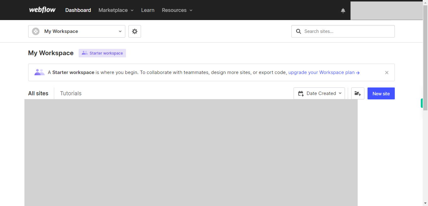
Open Webflow.
-
2.
Click on the Next button on the Supervity instruction widget. you will see a list of your projects. By selecting the specific project you want to work on, you can access its editing interface.
-
3.
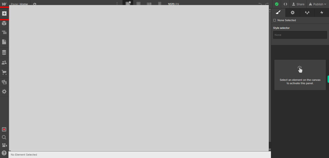
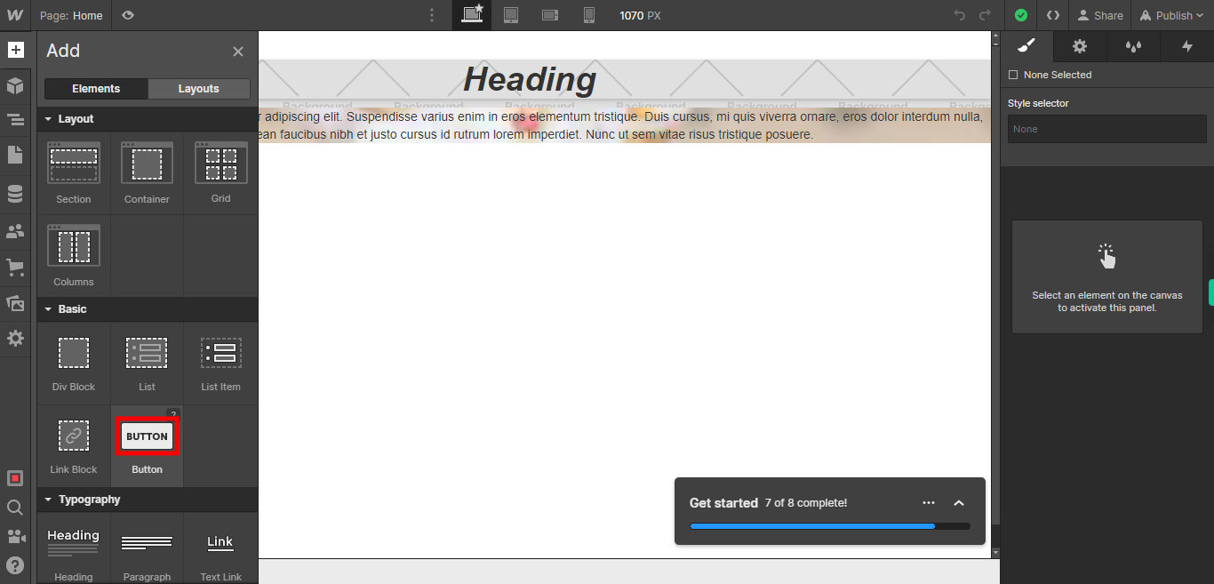
If you're unable to find the "+" icon to edit a web page in Webflow, there is an alternative method to access the design controls. First, click on the "Edit" button, usually located at the top right corner of the page or within the editor toolbar. This will open the editing options. Follow the below steps select design control->design here->OK. Click on the Next button on the Supervity instruction widget. To add elements to your project in Webflow, locate and click on the "+" icon or the "Add Elements" button. This action will open the elements panel, where you can find a variety of pre-built components and elements that you can add to your web page.
-
4.
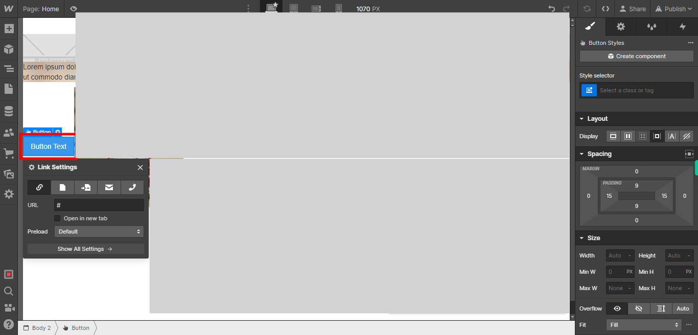
Click on the Next button on the Supervity instruction widget. To add a button to your web page, select the "Button" element from the list of elements and drag it to the desired location on your web page.
-
5.
To edit the text of the button, click on the button element and locate the text within it. Double-click on the text to activate the text editing mode, and then you can modify the text as desired. Click on the Next button on the Supervity instruction widget.
-
6.
To select the desired color for the button, you can click on the color picker or color swatch. This will open a color palette or allow you to input a specific color value. Click on the Next button on the Supervity instruction widget.
-
7.
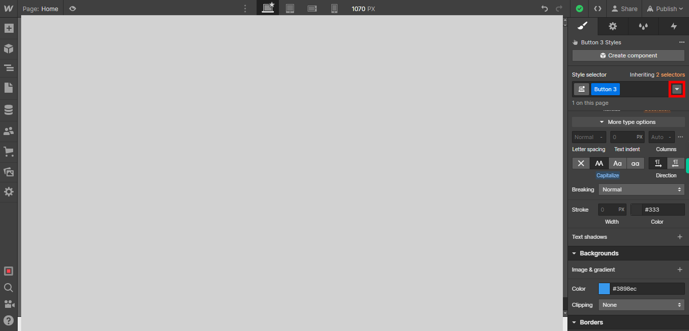
Clicking on the drop-down icon will display a drop-down menu with different states for the button. These states typically include options such as Normal, Hover, Pressed, etc. Each state represents a specific interaction or visual appearance of the button. Click on the Next button on the Supervity instruction widget.
-
8.
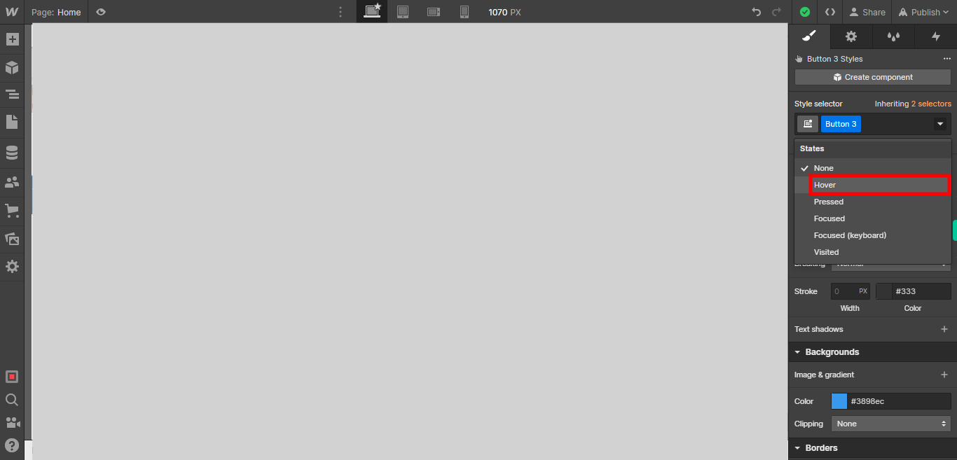
From the drop-down menu, select the "Hover" state. This state represents the appearance of the button when the cursor hovers over it. By choosing the "Hover" state, you can define specific styles and effects that will be applied to the button when it is being hovered over. Click on the Next button on the Supervity instruction widget.
-
9.
Click on the hover button.And select the button you want to add hover colour Click on the Next button on the Supervity instruction widget.
-
10.
Click on the Next button on the Supervity instruction widget. In the "Hover" state of the button, you can choose the desired background color that will be changed when you hover over the button. This allows you to create a visual effect that indicates interactivity and engagement.
-
11.
If you want to preview the changes you made to the button's hover state, you can click on the eye icon or preview button. This will allow you to see how the button will appear when it is hovered over by users. Previewing the button's hover state can help you ensure that the applied styles and color choices create the desired visual effect. However, if you are satisfied with the changes you made and do not need to preview them, you can simply ignore the preview option and continue editing or finalizing your design.


