This skill shows the steps to make Webflow responsive. Prerequisites:To ensure that you have at least one project available in the Webflow dashboard. [NOTE: Please make sure that log in to Webflow website before playing the skill]
-
1.
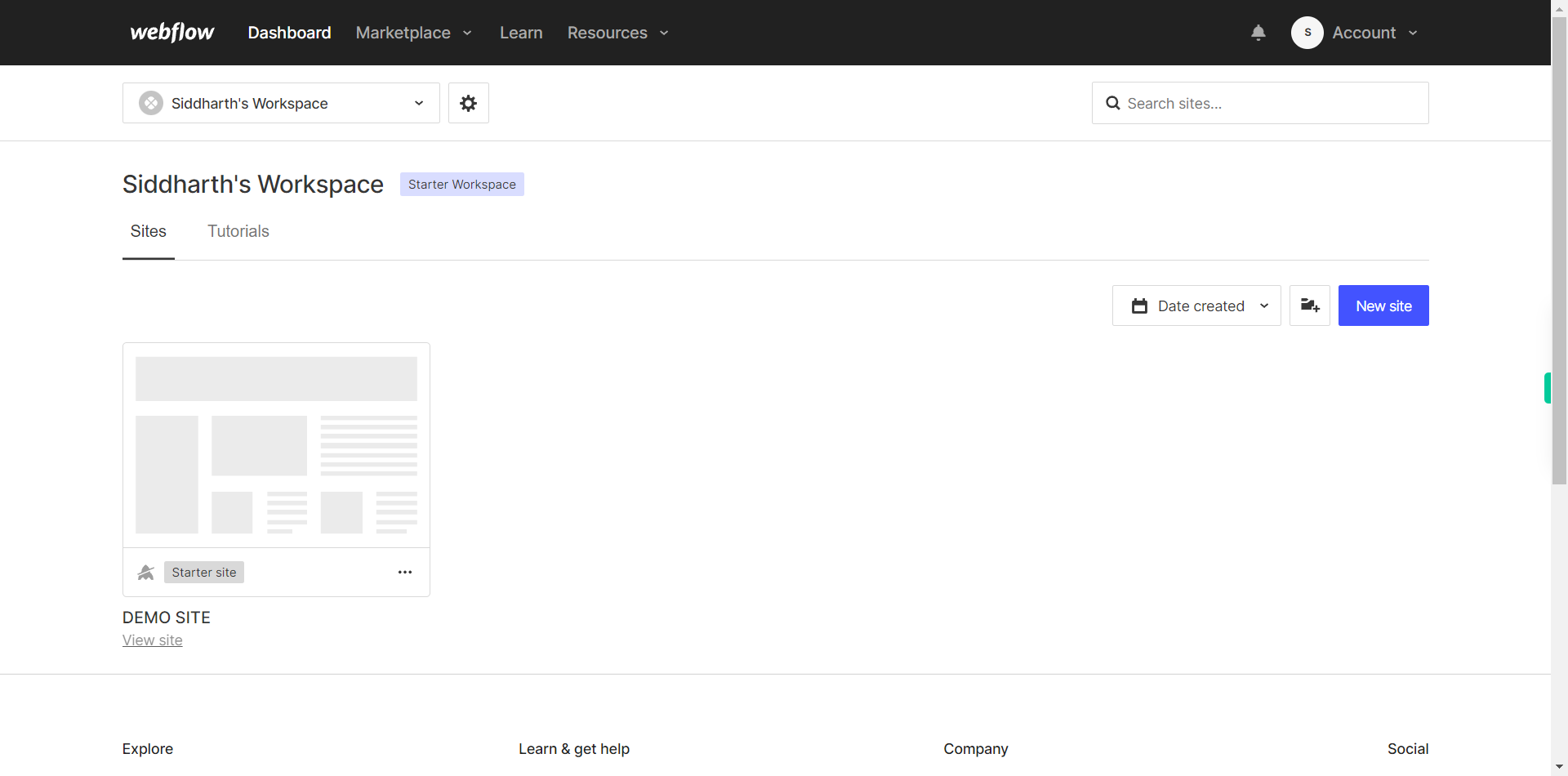
Open Webflow Dashboard.
-
2.
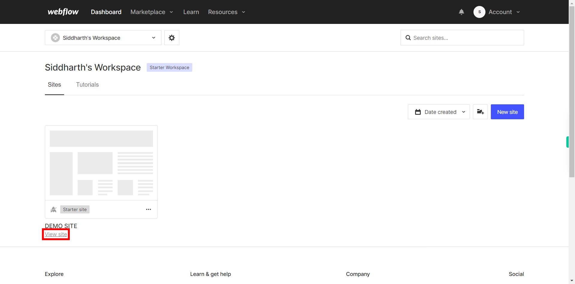
Click on the Next button in the Supervity instruction widget and then Open the Project or the Site you want to work on by clicking on "view site" option which is located under each website.
-
3.
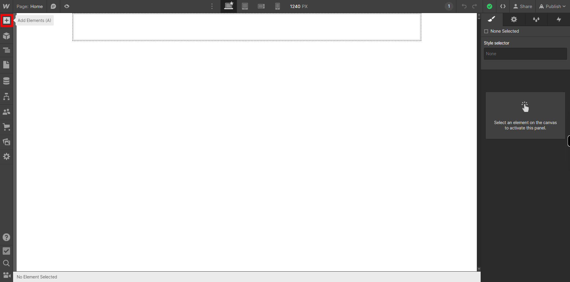
If you're unable to find the "+" icon to edit a web page in Webflow, there is an alternative method to access the design controls. First, click on the "Edit" button, usually located at the top right corner of the page or within the editor toolbar. This will open the editing options. Follow the below steps select design control->design here->OK. Click on the Next button in the Supervity instruction widget.
-
4.
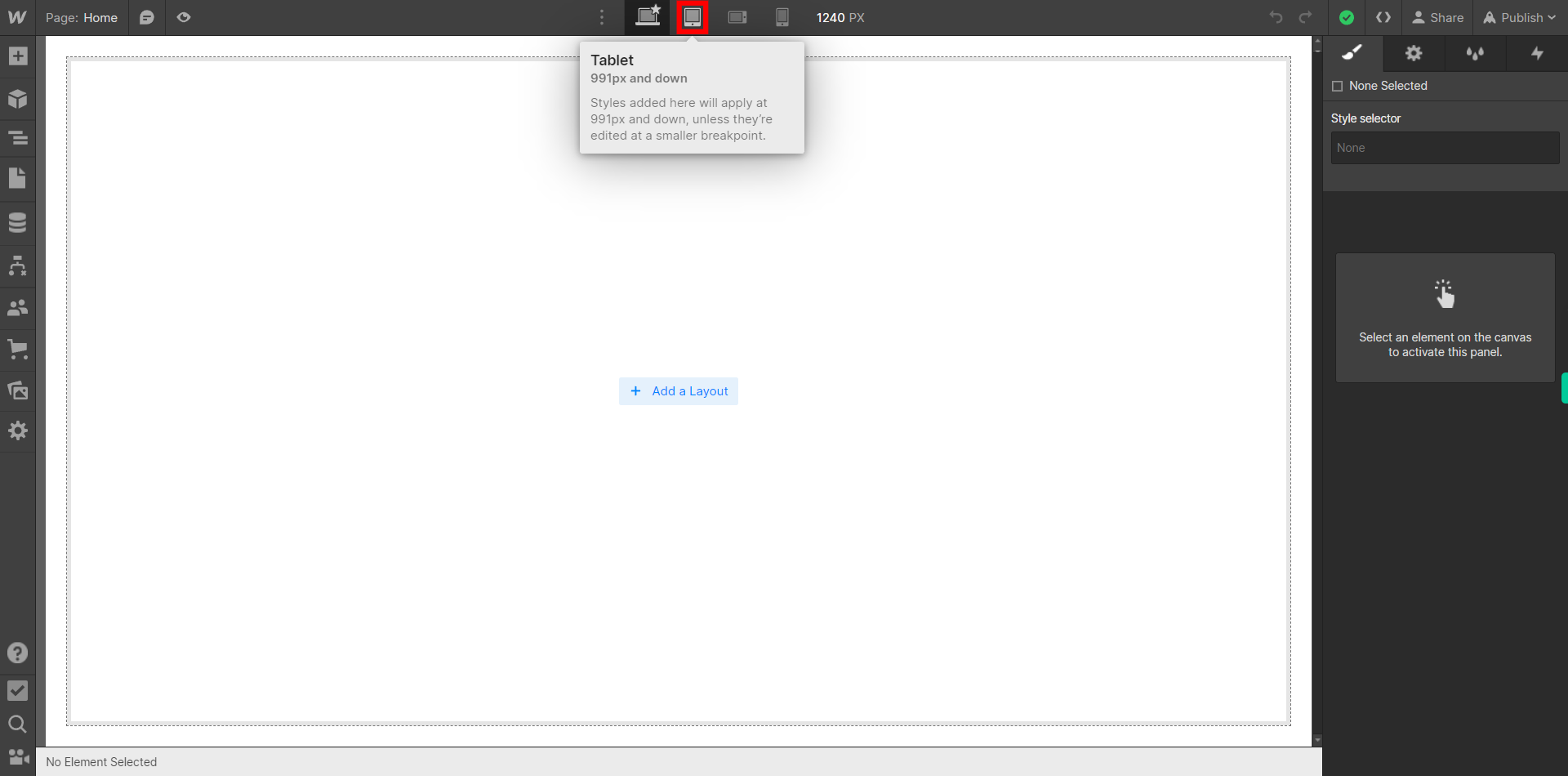
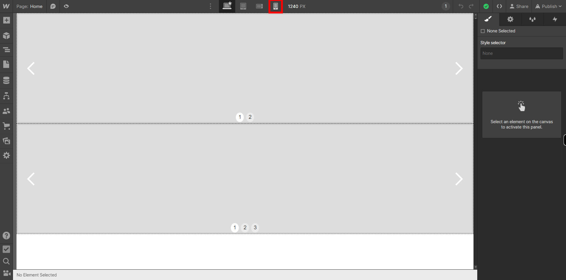
Click on "Next" button on Super Assistant then Switch to the "Mobile Portrait" view by clicking on the mobile portrait icon. This view allows you to customize the design specifically for small vertical screens, like smartphones in portrait mode.
-
5.
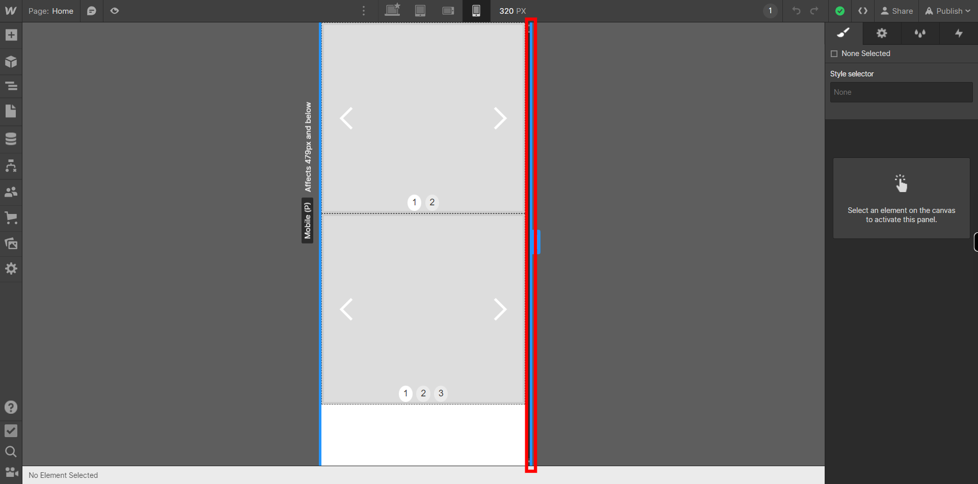
Click on the Right edge of the Design and drag it to set the Desired width according to what your client demands, Once you have set it, Click on the Next button on the Supervity Instruction widget.
-
6.
Click on any component on the screen that you want to work on and adjust according to the Mobile Portrait mode. Then a settings panel will open on the right.
-
7.
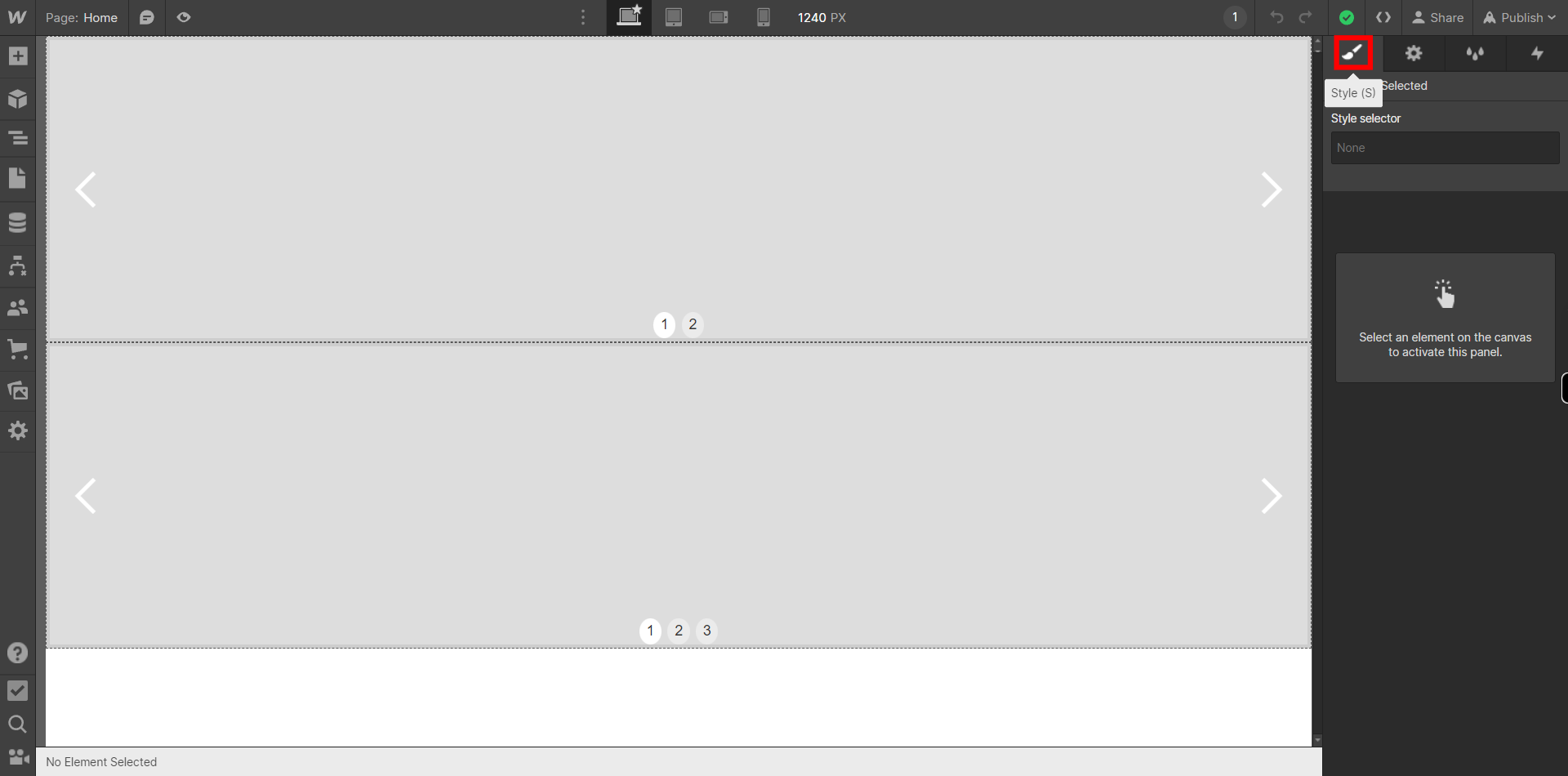
Click on the "Style" icon on the Top left corner on the Panel on the right which looks like a brush. This will enable to do settings like layout, Spacing, Size, Typography and etc.
-
8.
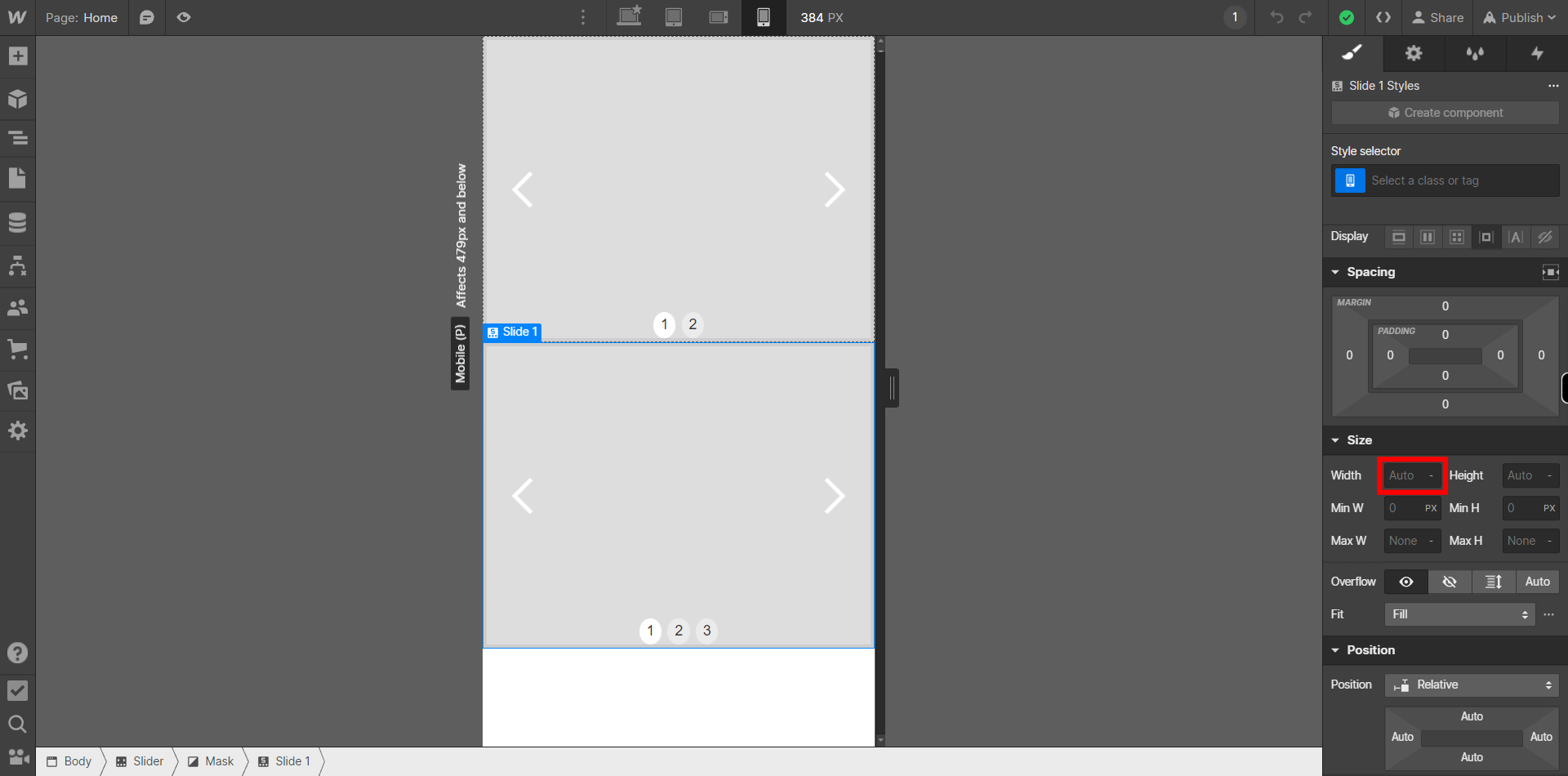
You can change the Width of the component according to the Mobile portrait view by clicking on the box beside "Width" under Size settings on the panel on the right. Then type in the desired value and then Click on the Next button on the Supervity Instruction Widget. You can also set Min width and Max width in a similar way by clicking on "Min W" and "Max W" respectively.
-
9.
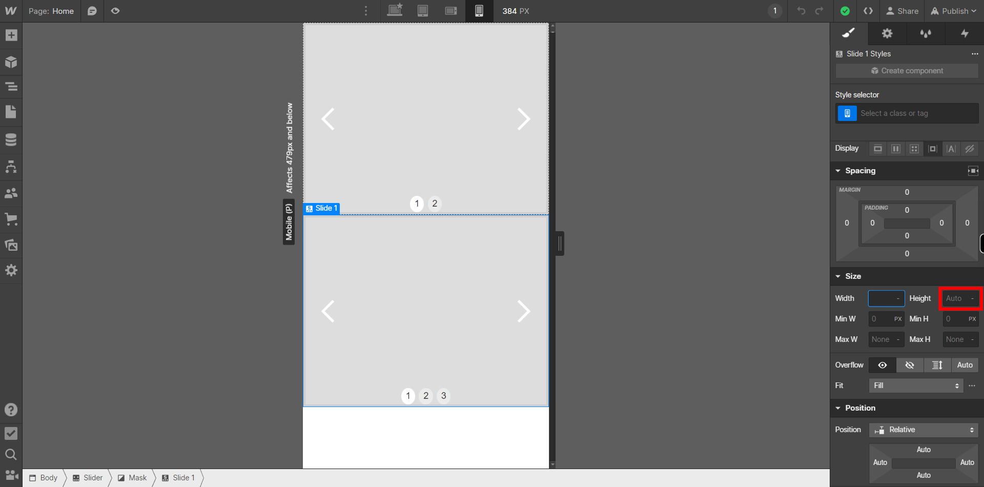
You can change the Height of the component according to the Mobile portrait view by clicking on the box beside "Height" under Size settings on the panel on the right. Then type in the desired value and then Click on the Next button on the Supervity Instruction Widget. You can also set Min Height and Max Height in a similar way by clicking on "Min H" and "Max H" respectively.
-
10.
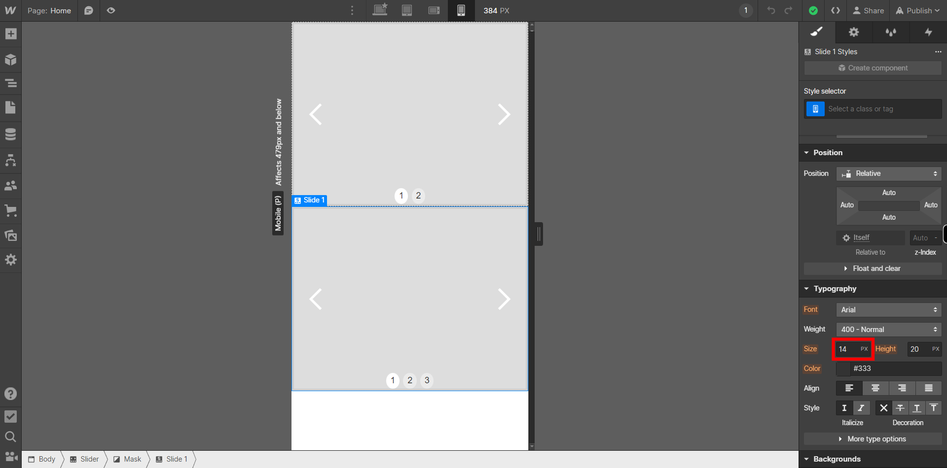
On the panel on the right side Under "Typography" menu, you can change the Font Size by clicking on the box beside "Size". Then type the desired Font Size according the Mobile Portrait view then Click on the Next button in the Supervity instruction widget.
-
11.
On the panel on the right side Under "Typography" menu, you can change the Font Height by clicking on the box beside "Height". Then type the desired Font Height then Click on the Next button in the Supervity instruction widget.

-
12.
Click on "Close" button on Super Assistant then Switch to the "Tablet" view by clicking on the tablet icon at the top of the Designer canvas. Here, you can make adjustments to the layout and styling specifically for tablet-sized screens. 1)Rearrange elements if necessary to optimize the layout for the smaller screen size. 2)Modify font sizes, margins, and padding to ensure readability and proper spacing. 3)Use the Webflow Designer's responsive options to hide or show elements, change their positioning, or adjust their dimensions based on the tablet view.
