This skill shows the steps to be followed to use style panel, you can easily customize the visual appearance of your elements consistent styling, and apply responsive styles to create designs.Prerequisite: The web page contains at least one element.[NOTE: Please make sure that log in to Webflow website before playing the skill]
-
1.
Open Webflow.
-
2.
Click on the Next button in the Supervity instruction widget. you will see a list of your projects. By selecting the specific project you want to work on, you can access its editing interface.
-
3.
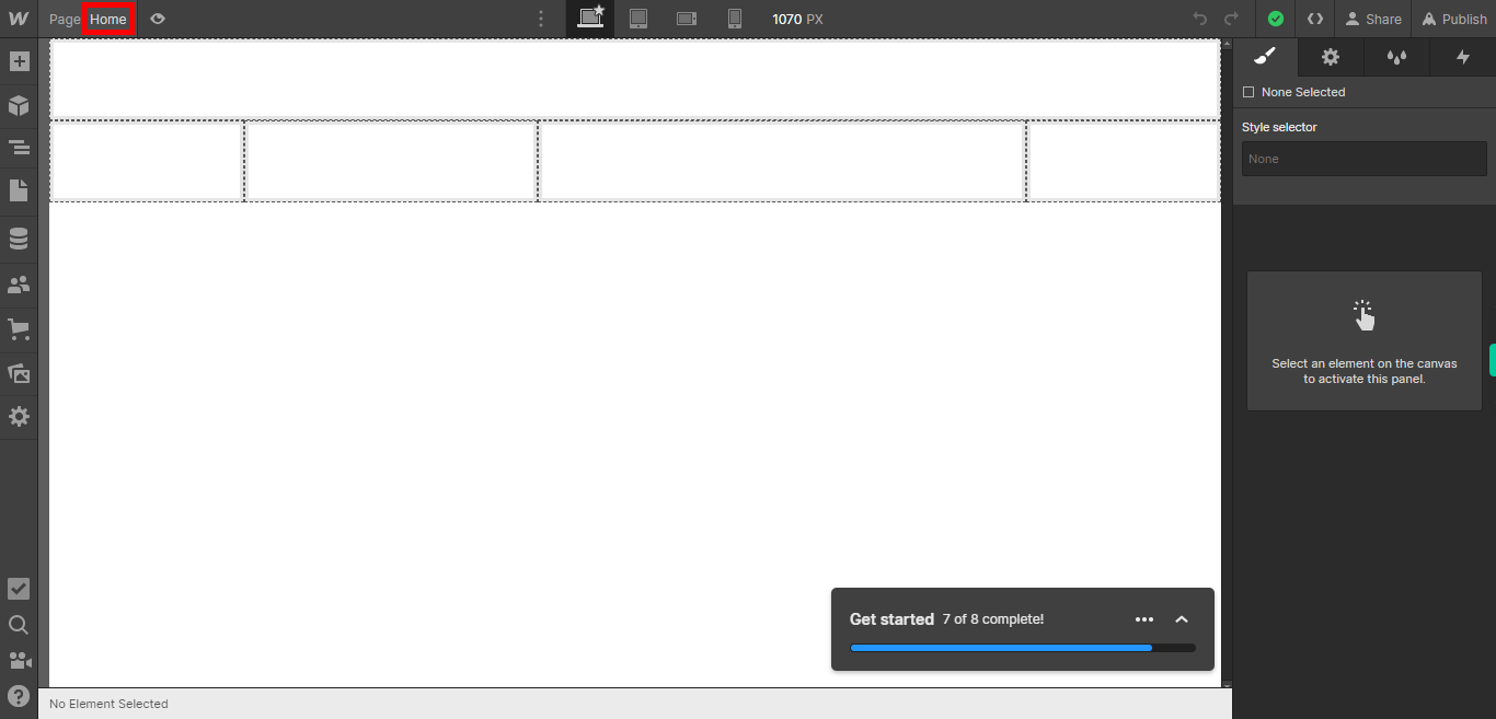
If you're unable to find the "+" icon to edit a web page in Webflow, there is an alternative method to access the design controls. First, click on the "Edit" button, usually located at the top right corner of the page or within the editor toolbar. This will open the editing options. Follow the below steps select design control->design here->OK. Click on the Next button in the Supervity instruction widget. To add style to a specific element, you need to first select that element. This can be done by clicking on or hovering over the desired element on the webpage. Once you have selected the element, you can apply various styling options such as changing the font, color, size, alignment, or adding borders and backgrounds.
-
4.
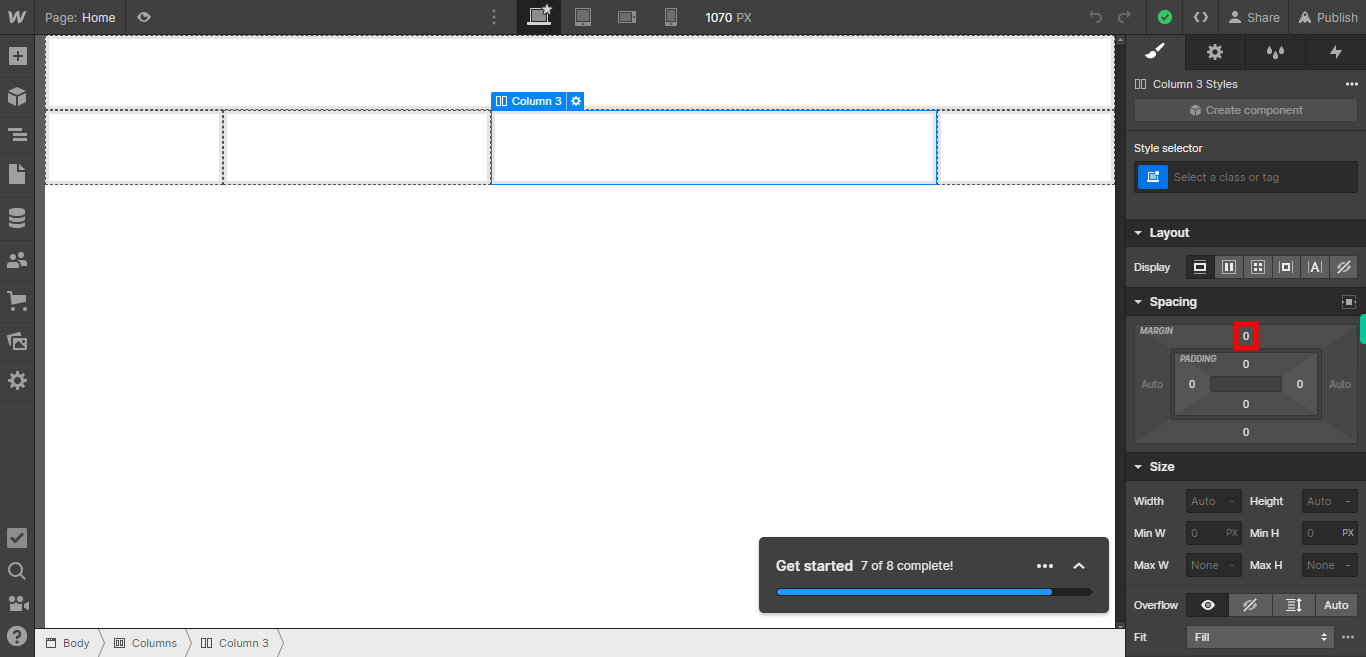
To apply padding and margin to an element, you need to select the element and access the styling options. Padding refers to the space between the content of an element and its border, while margin refers to the space between an element and its surrounding elements. Click on the Next button in the Supervity instruction widget.
-
5.
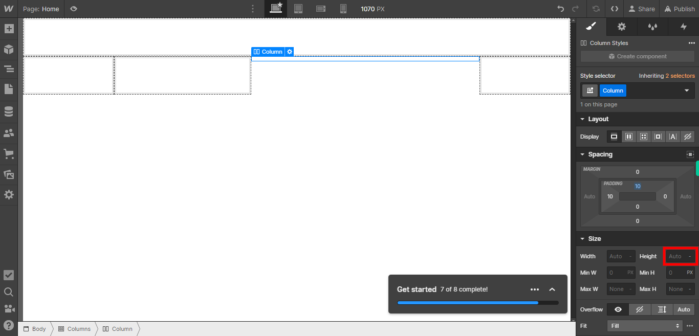
To specify the height and width of an element, you can use CSS properties. Height refers to the vertical dimension of the element, while width refers to the horizontal dimension. When setting the height and width of an element, you can use different units of measurement such as pixels (px), percentages (%), or ems (em). Pixels provide a fixed size, percentages allow for relative sizing based on the parent element, and ems are relative to the font-size of the element. Click on the Next button in the Supervity instruction widget.
-
6.
To select the font type for an element, you can use the CSS font-family property. The font-family property allows you to specify the preferred font or a list of fonts to be used for the selected element. The browser will use the first available font from the list. Click on the Next button in the Supervity instruction widget.

-
7.
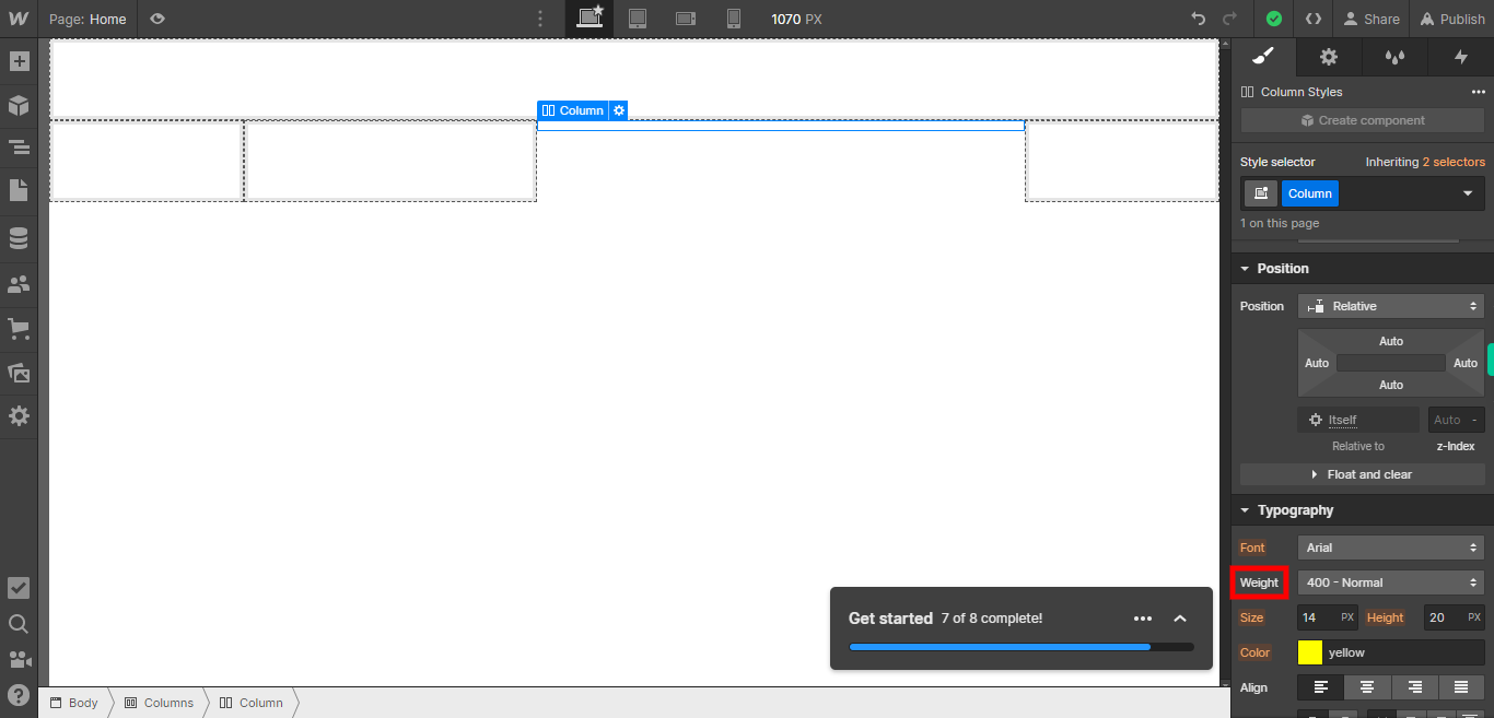
To specify the font-weight of an element, you can use the CSS font-weight property. The font-weight property allows you to control the thickness or boldness of the text. Click on the Next button in the Supervity instruction widget.
-
8.
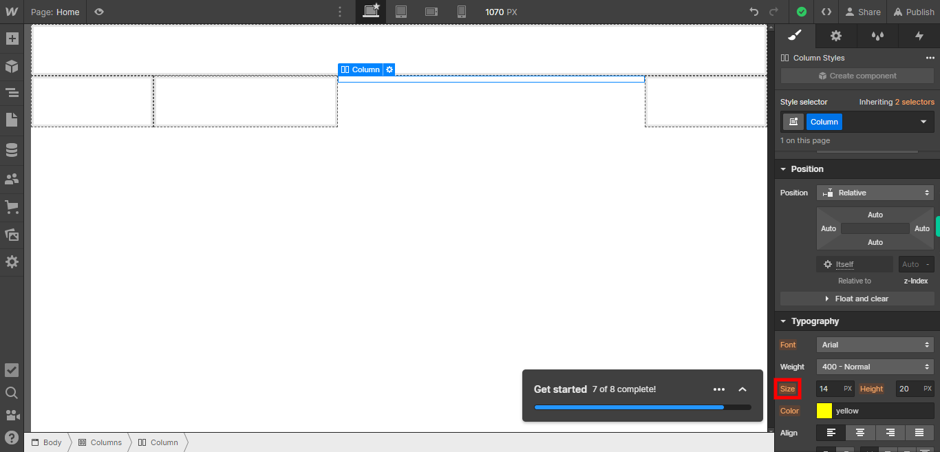
Use the CSS property font size to define the size of the text inside the element. Use the CSS property height to define the height of the element. You can specify the font size in different units, such as pixels (px), points (pt), percentages (%). Click on the Next button in the Supervity instruction widget.
-
9.
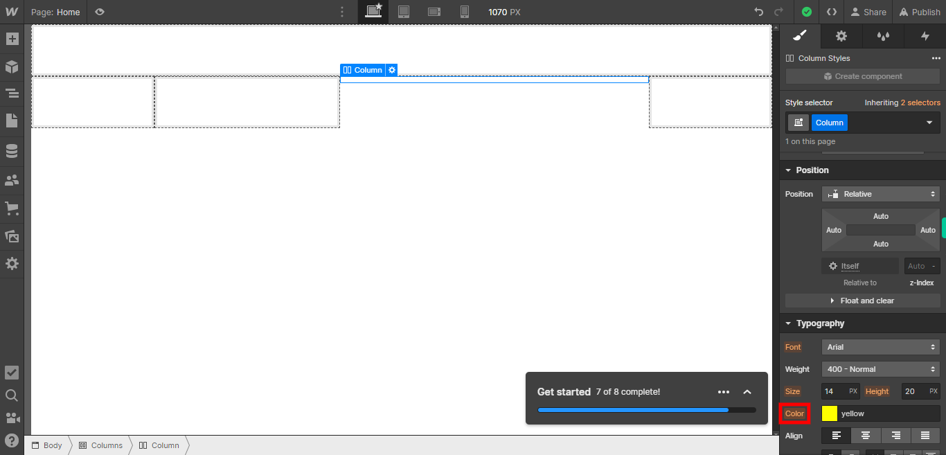
To select the color of an element, you can use the CSS property called color. This property allows you to specify the color of the text content inside the element. Click on the Next button in the Supervity instruction widget.
-
10.
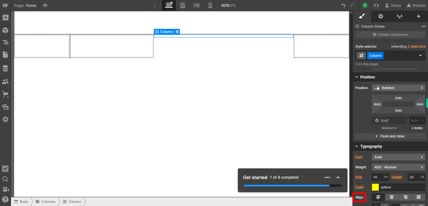
To align an element, you can use the CSS property called "text-align". This property allows you to specify the horizontal alignment of the text content inside the element. By specifying the desired alignment option in the "text-align" property, you can control how the text content inside the element is aligned horizontally. Click on the Next button in the Supervity instruction widget.
-
11.
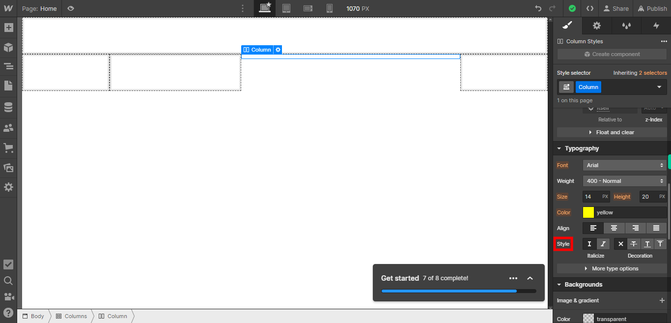
By applying the desired font style using the font-style property, you can control the appearance of text in your web page and achieve the desired visual effect. Click on the Next button in the Supervity instruction widget.
-
12.
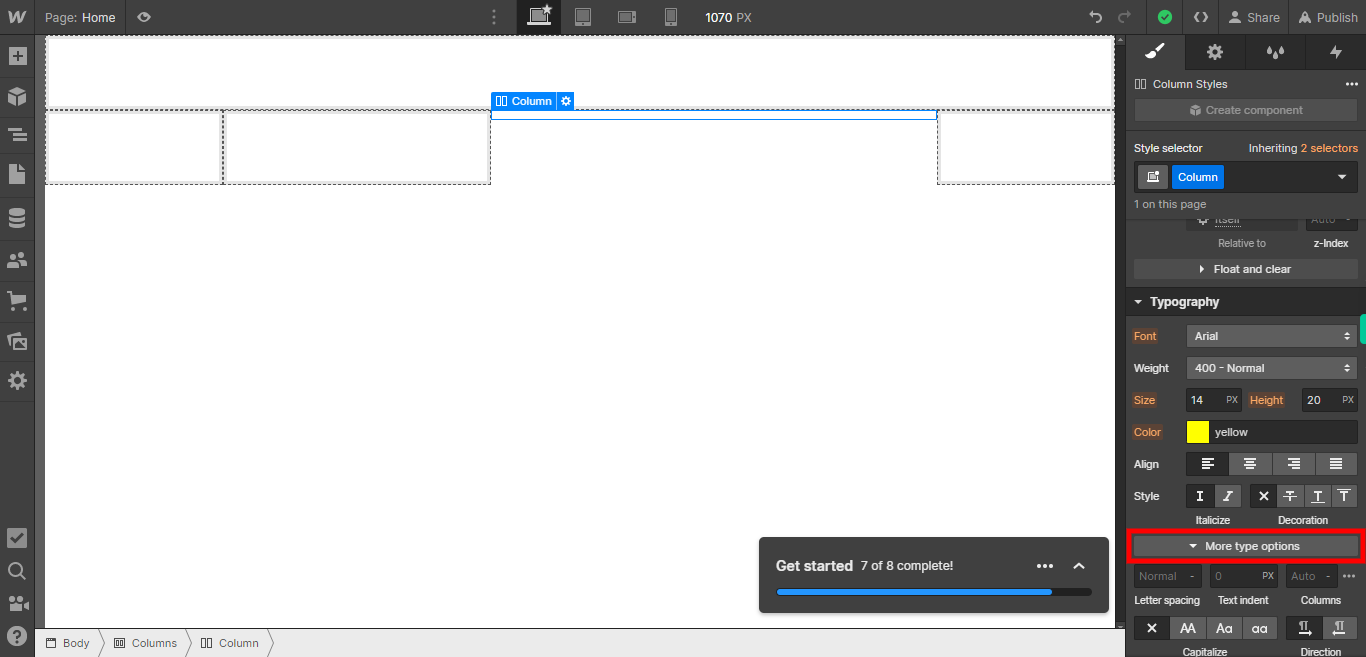
To access additional options or settings, you can click on the "More Options" button. This will expand the options panel, providing you with additional customization choices and controls. Click on the Next button in the Supervity instruction widget.
-
13.
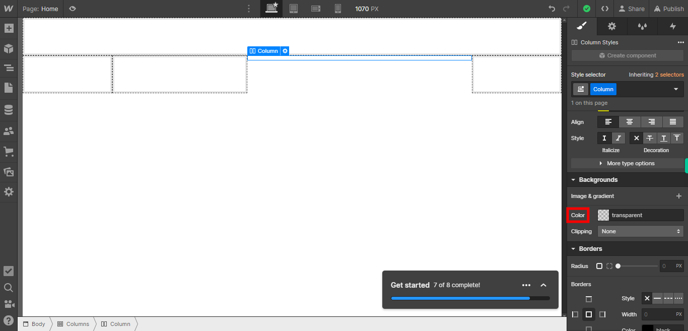
To add a background color to an element, you can select the element you want to modify and then access the styling options. Within the styling options, you will find the "Background Color" property. Clicking on it will allow you to choose a color from the color palette or enter a specific color code. Click on the Next button in the Supervity instruction widget.
-
14.
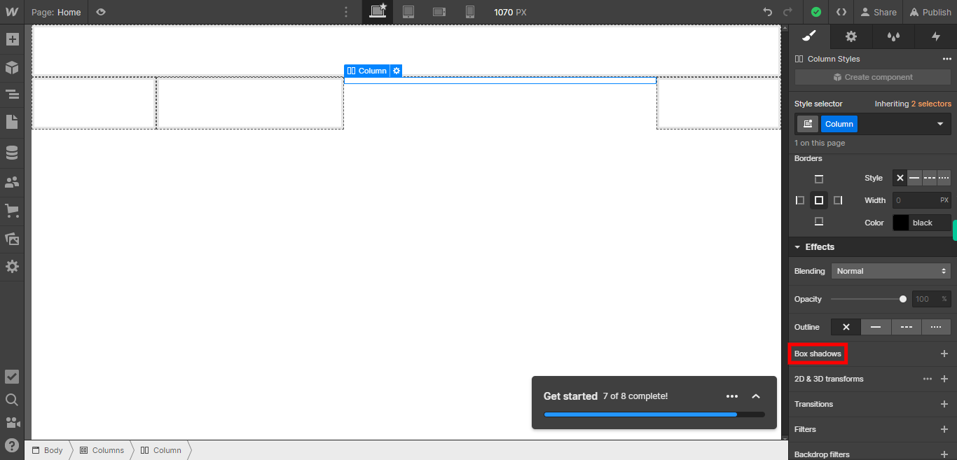
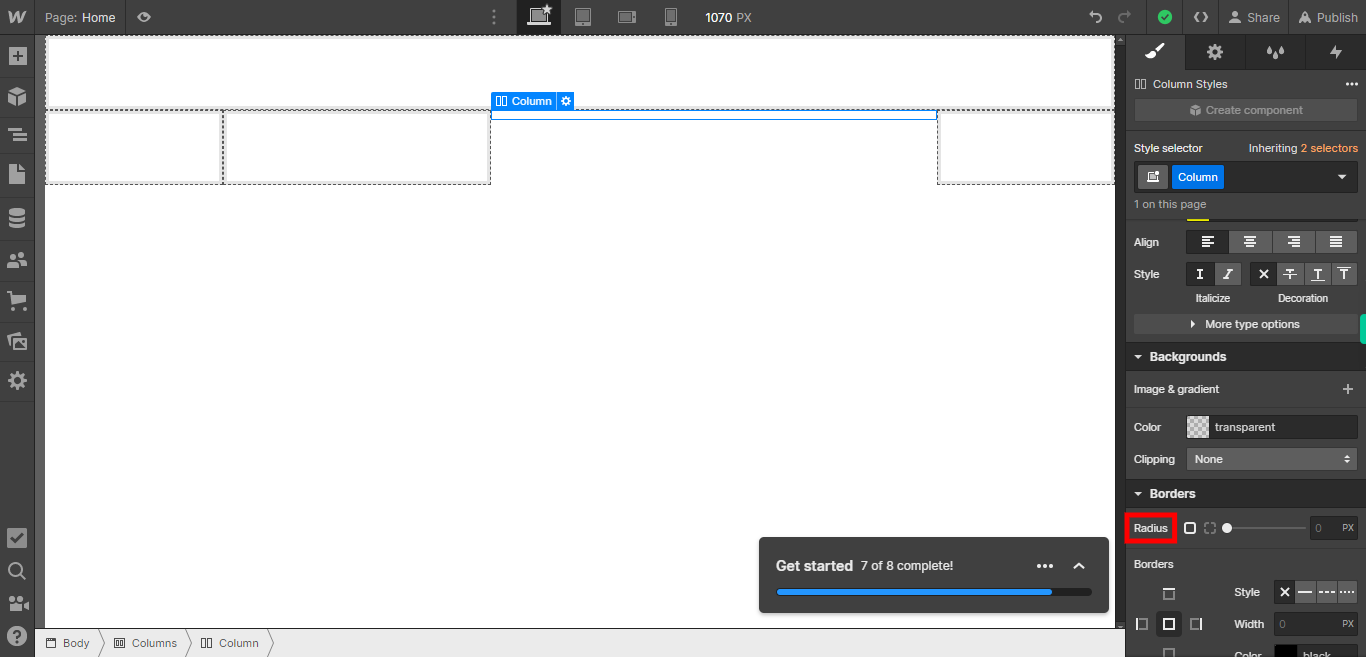
When selecting the "Radius" option, you have the ability to set the corner radius of an element. This feature allows you to round the corners of an element, giving it a more visually pleasing and softer appearance. Click on the Next button in the Supervity instruction widget.
-
15.
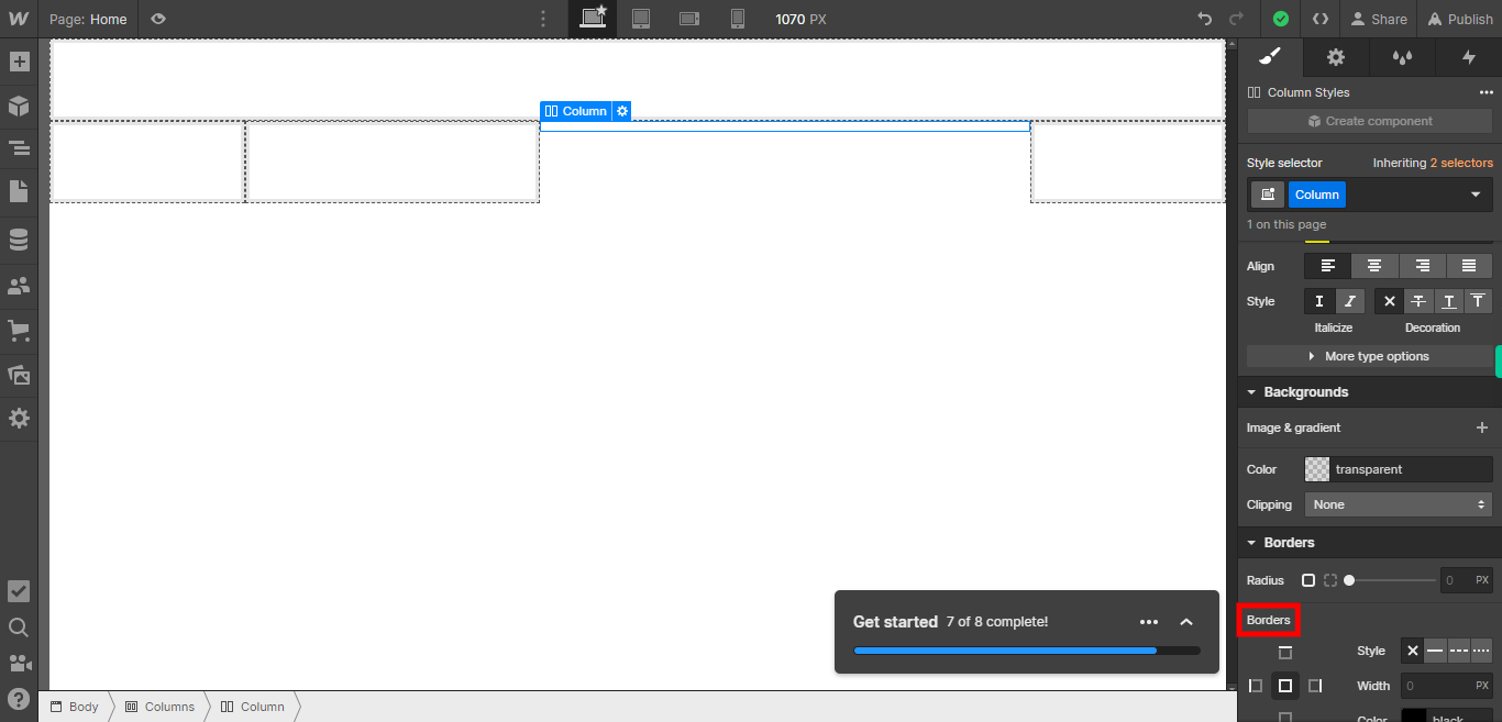
When selecting a "Borders" style, you have the option to choose from various border styles for an element. This feature allows you to define the appearance of the borders around an element, enhancing its visual presentation. You can select different border styles such as solid, dashed, dotted, double, or even custom styles. Click on the Next button in the Supervity instruction widget.
-
16.
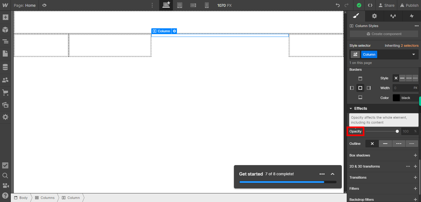
When selecting "Opacity," you have the ability to adjust the transparency or opacity level of an element. Opacity refers to the degree to which an element allows light to pass through it, affecting its visibility and visual appearance. By adjusting the opacity, you can make an element more transparent or less transparent, depending on your desired effect. A higher opacity value makes the element more visible and opaque, while a lower opacity value makes it more transparent. Click on the Next button in the Supervity instruction widget.
-
17.
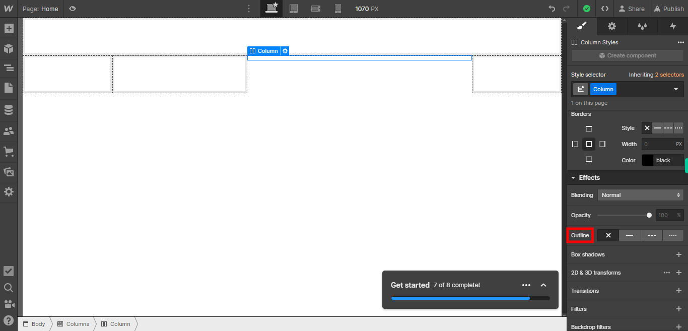
When selecting "Outline," you have the option to add a visible border or outline around an element. The outline is typically displayed outside the element's dimensions, highlighting its shape or providing a visual emphasis. By choosing the "Outline" option, you can customize the color, thickness, and style of the outline to suit your design preferences. Click on the Next button in the Supervity instruction widget.
-
18.
19. Click on the Close button in the Supervity instruction widget. If you wish to apply additional effects to the element, you can do so by selecting the appropriate options. These effects may include shadows, filters, transitions, animations, and more. By applying these effects, you can enhance the visual appeal and interactivity of the element, creating a more engaging user experience. However, if you are satisfied with the current styling and do not want to add any additional effects, you can choose to leave it as it is. The decision to apply more effects or not ultimately depends on your design goals and the desired outcome for the element.
