This skill shows the steps to be followed to create a button and add styles to buttons the style part includes color, height, width, and other factors.Prerequisites:To ensure that you have at least one project available in the Webflow dashboard.[NOTE: Please make sure that log in to Webflow website before playing the skill]
-
1.
Open Webflow.
-
2.
Click on the Next button on the Supervity instruction widget. you will see a list of your projects. By selecting the specific project you want to work on, you can access its editing interface.
-
3.
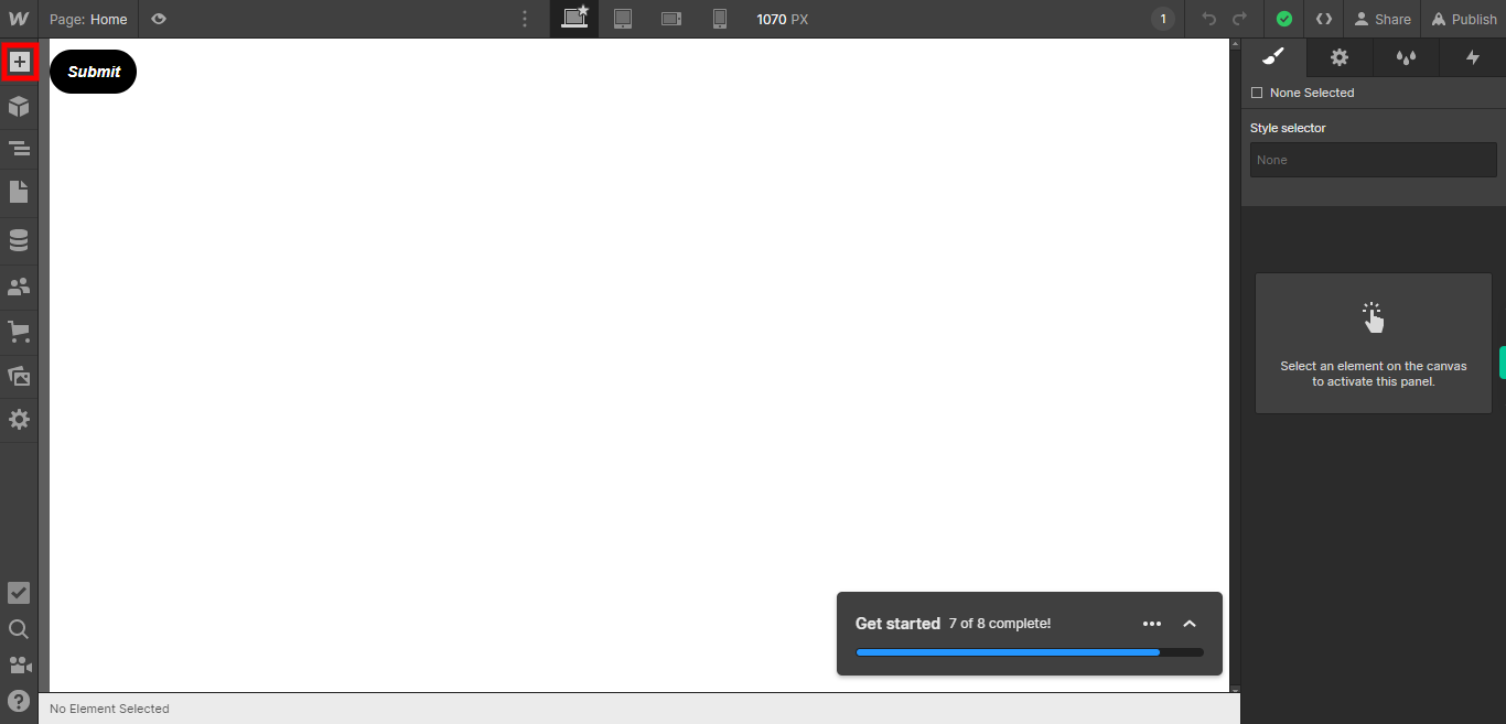
If you're unable to find the "+" icon to edit a web page in Webflow, there is an alternative method to access the design controls. First, click on the "Edit" button, usually located at the top right corner of the page or within the editor toolbar. This will open the editing options. Follow the below steps select design control->design here->OK. Click on the Next button on the Supervity instruction widget. To add elements to your project in Webflow, locate and click on the "+" icon or the "Add Elements" button. This action will open the elements panel, where you can find a variety of pre-built components and elements that you can add to your web page.
-
4.
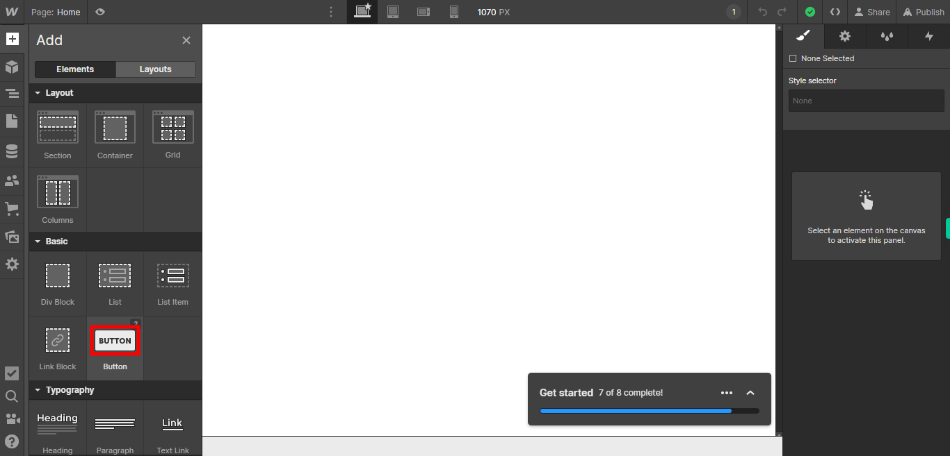
To add a button to your web page, click on the "Button" icon. This will open a selection of button styles and options for customization.
-
5.
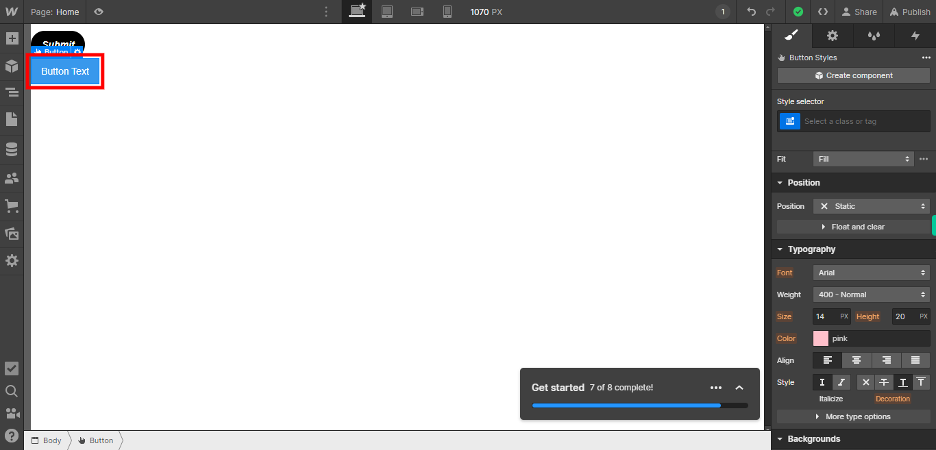
Select the button element that you have added to your web page, and edit the text displayed on the button according to your requirements. Click on the Next button on the Supervity instruction widget.
-
6.
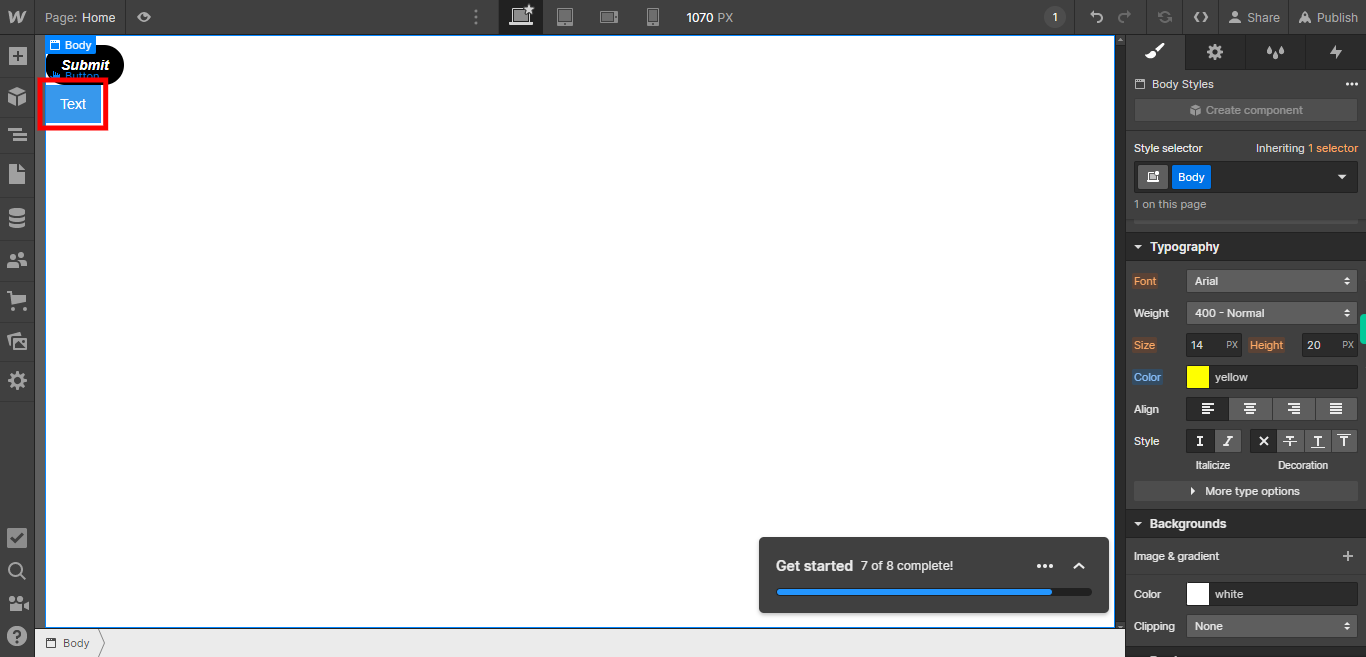
Select the specific element on your web page to which you want to apply styles or formatting, and then proceed to add the desired styles or customize its appearance according to your preferences. Click on the Next button on the Supervity instruction widget.
-
7.
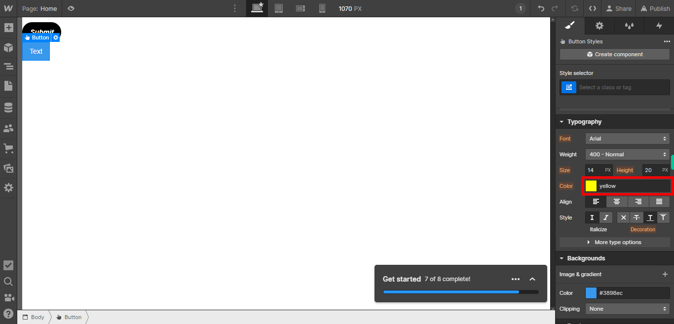
Type the desired color value or select a color from the color picker to set the input color for the selected element. Click on the Next button on the Supervity instruction widget.
-
8.
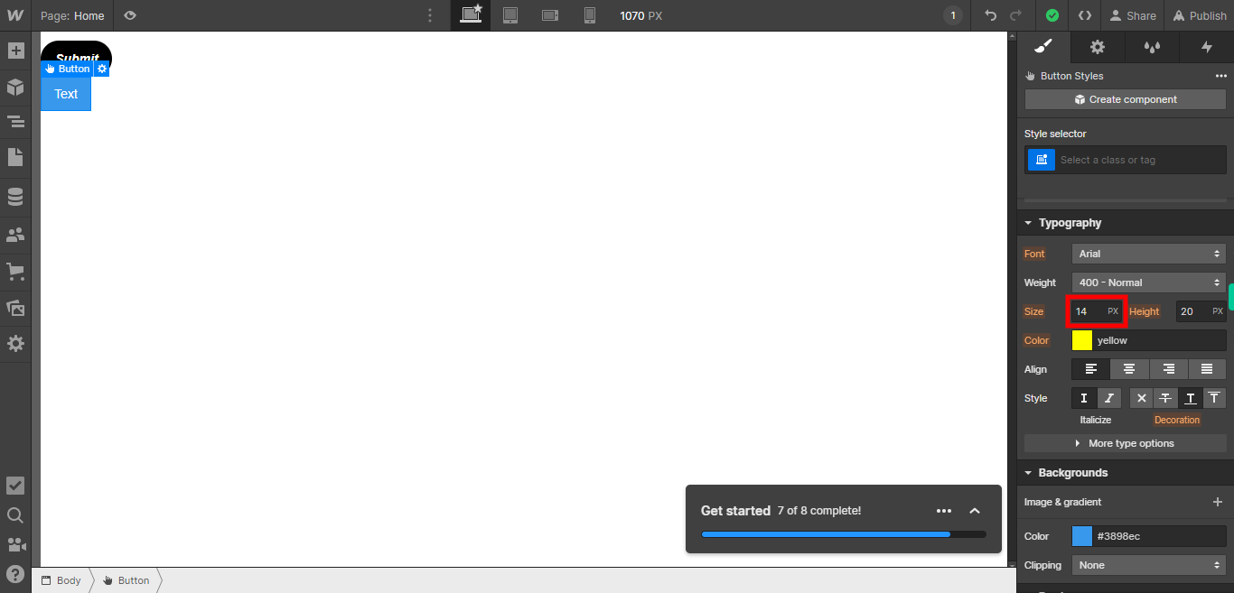
Choose the desired size option to set the size of the button for the selected element. Click on the Next button on the Supervity instruction widget.
-
9.
Choose the desired Height option to set the size of the button for the selected element. Click on the Next button on the Supervity instruction widget.

-
10.
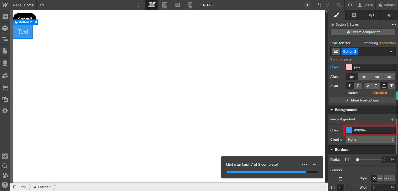
Type in the desired color code or select a color from the color palette to set the background color of the button for the selected element. Click on the Next button on the Supervity instruction widget.
-
11.
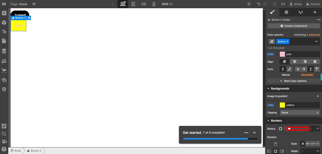
Select the desired radius value to set the corner curvature of the button for the selected element. Click on the Next button on the Supervity instruction widget.
-
12.
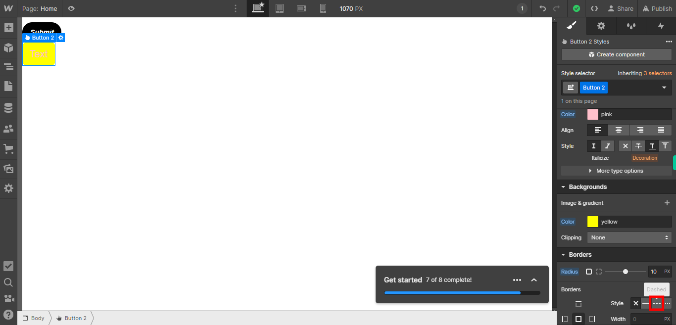
Select the desired border style, thickness, and color for the selected element. This allows you to customize the appearance of the borders of the element. Click on the Close button on the Supervity instruction widget.
